So... normally I like to give everyone and everything the benefit of the doubt. But I won’t lie there are times when I will judge someone or something merely on a first impression appearance. That’s not to say that first impressions are always right (*cough jory cough*) But I do believe there are some things that you can judge whether or not its worth your time.
By some things I mean movies, by movies, I mean Without a Paddle. By that I mean... Without a Paddle is without a doubt the worst movie poster ever made. So much so that I refuse to watch it.
And you say oh Rose, you bitchy catamaran surely it’s not THAT bad. To that I say... Fuck you and listen to me for tonight I will write a blog of doctoral thesis proportion to prove my point that THIS....

Is the worst movie poster ever made.
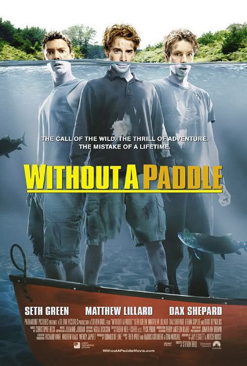
It looks innocent enough doesn’t it? Three dudes in a boat underwater... sounds like a recipe for hilarious disaster.
First. And foremost the thing that bothers me the most about this poster. Seth Green is 5’4. Dax Shepard is 6’2 and Matthew Lillard is 6’3. Both Dax and Matt have almost a foot on Seth. Do they look like they are a foot taller than Seth in that poster??? Don’t give me that bullshit about Seth is standing on something. That’s just bad editing because unless Seth has "a little captain in him" you can see the top of one sneaker and not the other. He should still be shorter than the two of them. Foreground or not.
The poster would like to suggest that the three are trapped in the middle of lake in the middle of nowhere... but that water can’t be more than 8 feet deep. In Theory they could just you know wade back to the shore. That is clearly sand that boat is resting on. The movie should be called "Inconveniently Standing in Water"
Next is the expressions on their faces... None of them suggest to me that they fully comprehend the peril of their inconvenience. Both Matt and Dax look as if they’ve seen the world’s largest cock while Seth has a look that suggests he is the owner of said cock. And for the record lake water is disgusting. why would you stand there mouth agape filtering in water that fish start, create, and end life in as well as all the body functions in between.
Next. This is mainly just poor editing... but look at their faces... notice how they are no longer besmirched under the water line. However their clothes and legs are still soiled... is this magic water? is only clean at 3 ft and then dirty again? And speaking of clothes... How in the hell am I suppose to determine what season this is... some of them are wearing shorts and a tank top, some are wearing sweat shirts and jeans. I mean yeah it’s kinda inconvenient to be in the water during the summer but I mean wouldn’t it be more disastrous if this occurred
in the winter? I mean how am I determine the severity of their situation?
And why are they standing at the same end of the boat... that’s probably how they sank in the first place. distribute weight gentlemen.
The more I look at this poster the more I remember just how terrible it is. Seriously just take a good look at it and soon it will piss you off too.
So there you have it.
Now I’m not saying that all bad posters produce bad movies... but bad posters produce bad movies.

